

Licht in der Kunst
der Gestaltung
der Gestaltung
Radiobeitrag (4:32) von Martina Kothe, NDR Kultur, 1/2025, zur Ausstellungsgestaltung für Frischer Wind, KZ überlebt und Caspar David Friedrich im Landesmuseum Hannover / Transcripts below
Light in the Art of Design
By Martina Kothe for NDR Kultur radio station / transcript in english
Martina Kothe I am strolling through the rooms of the Landesmuseum in Hanover with Anja Leidel. She studied graphic design and works mainly in publication design and exhibition design. She also works in this capacity at the museum.
Anja Leidel Design is always designing with light, especially using lightness and darkness. White space. That's what you use on the page. How much light, how much dark is there? How do I create tension? And that can of course be used incredibly well in a room. But it also takes place in a book.
MK With every new show, with every book project, she immerses herself in the mood of the pictures, the texts, designs the graphic elements, often with music in her ear, and thinks about how she can put everything in the best light.
AL What is possible and what is the core? What elements do I need to represent and feel that? In other words, I am a representative of the future viewer. And I look at what it does to me, the topic. How can I understand it and what do I need to understand it even more clearly? To make it even clearer?
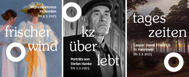
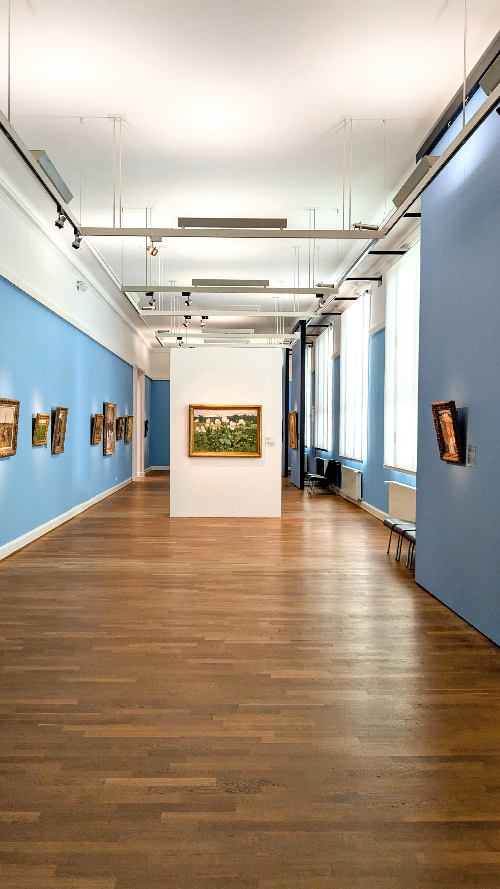
MK In the “Fresh Breeze” exhibition on impressionism, the walls of the Landesmuseum Hannover are painted in different colors. From a dark blue-green to a summery yellow to a light blue room and other color moods. Paintings are highlighted on mobile walls painted white.
AL We create a connection through the white, which appears in every room and stands for light itself, and the rooms are visually connected, even when we move from summer to winter. So back there, the poppy painting, for example, has white blossoms itself and looks much more radiant, much more expressive on the white wall than it would have been on the colored walls around it.
AL We create a connection through the white, which appears in every room and stands for light itself, and the rooms are visually connected, even when we move from summer to winter. So back there, the poppy painting, for example, has white blossoms itself and looks much more radiant, much more expressive on the white wall than it would have been on the colored walls around it.
MK Black and white photographs by Stefan Handke are currently on display downstairs on the first floor. The artist has portrayed concentration camp survivors. The walls are black, the large-format faces look at you all the more intensely. When you step through the door, you look directly at a large map in shades of gray on which concentration camps are marked with yellow dots. The atmosphere is fundamentally different from that of the Impressionists. The colors are oppressive, including the yellow.
AL That is to say, if you step behind the map and recognize the striped pattern, which is of course associated with the prisoners' clothing in the concentration camps, then you will probably be a little bit shocked. Even if you don't realize it, you'll subliminally notice it. And that will possibly make some people think.
MK The daytime paintings by Caspar David Friedrich on the upper floor are staged in a completely different way. Wine-red walls and several small paintings that capture the different lighting scenes throughout the day.
AL The wall color could not be changed here. So I asked myself: how can I make the context signs blur a little more? Actually disappear into the wall. But that they still have a meaning.
MK The large signs, which provide information about the painting method and the preliminary studies underneath, shine as if illuminated by the sun. They are primed with a color gradient that extends into rose and yellow.
AL And so they take a step back and become light themselves. They thematize the light by printing this colour gradient on them. It's reminiscent of a sunrise, a sunset, details from the actual works by Caspar David Friedrich. And I thought that was a good reference to the paintings. So the eye is gently drawn back to them.
Licht in der Kunst der Gestaltung
Ein Radiobeitrag von Martina Kothe für NDR Kultur / Transkript
Martina Kothe Mit Anja Leidel laufe ich durch die Räume des Landesmuseums Hannover. Die studierte Grafikdesignerin arbeitet hauptsächlich im Publikationsdesign und der Ausstellungsausstattung. In dieser Funktion ist sie auch im Landesmuseum tätig.
Anja Leidel Gestaltung ist ja immer Gestalten mit Licht, also mit Hell und Dunkel vor allem. Weißraum. Damit arbeitest du ja auf dem Blatt: Wie viel hell, wie viel dunkel gibt es? Wie erzeuge ich Spannung? Und das kann im Raum natürlich unglaublich toll genutzt werden, aber es findet ebenso in einem Buch statt.
MK Bei jeder neuen Schau, bei jedem Buchprojekt taucht sie ein in die Stimmung der Bilder, der Texte, konzipiert, häufig mit Musik im Ohr, die grafischen Elemente, überlegt, wie sie alles ins beste Licht setzen kann.
AL Was ist möglich? Und was ist der Kern? Was brauche ich für Elemente um das darzustellen? Und zu fühlen. Das heißt, ich bin im Endeffekt ein Vertreter, eine Vertreterin der späteren Betrachter, und schaue, was macht es mit mir, das Thema. Wie kann ich es verstehen, und was brauche ich, um das noch deutlicher zu machen.
MK In der Ausstellung Frischer Wind mit Werken des Impressionismus sind die Wände im Hannoverischen Landesmuseum unterschiedlich farbig gestaltet. Von einem dunklen Blau-Grün geht es ins sommerliche Gelb und von dort in einen hellblauen Raum und in weitere Farbstimmungen. An weiß gestrichenen, mobilen Wänden werden Bilder besonders in Szene gesetzt.
AL Wir schaffen hier eine Verbindung über das Weiß, das in jedem Raum vorkommt, und für das Licht an sich steht. Beides passt zusammen, obwohl wir vom Sommer in den Winter gehen. Also da hinten, das Mohnbild zum Beispiel, hat ja selber weiße Blüten und wirkt auf der weißen Wand, noch mal viel strahlender, viel bedeutender, als es das an der farbigen Wand zwischen allen Bildern getan hätte.
MK Im Untergeschoss werden gerade schwarz-weiß Fotografien von Stefan Hanke gezeigt. Er hat KZ-Überlebende porträtiert. Die Wände sind schwarz, die großformatigen Gesichter schauen einen umso intensiver an. Wenn man durch die Tür tritt, blickt man direkt auf eine in Grautönen gestaltete große Landkarte, auf der Konzentrationslager mit gelben Punkten markiert sind. Die Atmosphäre ist fundamental anders, als bei den Impressionisten. Die Farben wirken beklemmend, auch das Gelb.
AL Der nächste Schritt war für mich zu überlegen, wo ich diese Beklemmung noch mal steigern kann. Die andere Seite der Karte, die auf einem gelben Podest steht, ist in einem grau-schwarzen Streifenmuster bedruckt. Das heißt, wenn man hinter die Karte tritt und das Streifenmuster erkennt, was natürlich mit der Häftlingskleidung in den Konzentrationslagern assoziiert ist, dann wird man wohl ein kleines bisschen erschrecken. Selbst wenn man sich das nicht vor Augen führt, wird man es unterschwellig wahrnehmen, und das dürfte für manche ein Nachdenken auslösen.
MK Ganz anders inszeniert sind die Tageszeiten-Bilder von Caspar David Friedrich im Obergeschoss, weinrote Wände und mehrere kleine Gemälde, die die unterschiedlichen Lichtstimmungen im Verlauf eines Tages einfangen.
AL Die Wandfarbe war nicht zu verändern. Das heißt, ich habe mich dann gefragt, wie kann ich das machen, dass die Kontextschilder ein bisschen mehr verschwimmen, genau genommen in der Wand verschwinden, dass sie aber trotzdem eine Bedeutung kriegen.
MK Die großen Schilder die unter anderem über Malweise und die darunter liegenden Vorstudien informieren, leuchten wie von der Sonne beschienen. Sie sind mit einem Farbverlauf, der bis ins Rosé und Gelbfarbene geht, grundiert.
AL Und so treten sie einen Schritt zurück und werden selbst zum Licht. Also sie thematisieren das Licht, indem ich diesen Farbverlauf da drauf gedruckt habe, der an Sonnenaufgang, Sonnenuntergang, an Details aus den eigentlichen Werken erinnert. Und das ist, fand ich, eine gute Referenz auf die Werke. Das heißt, der Blick wird sanft wieder dorthin gelenkt.